Portfolio
Work
Design samples, working demos and system-design write-ups. Every one of them opens — nothing here is a screenshot.
Selected work
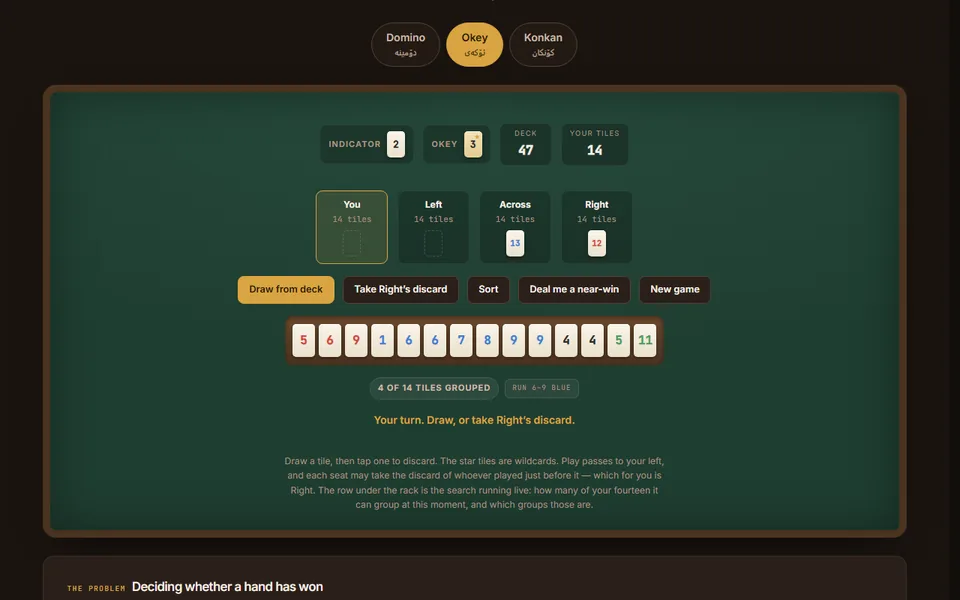
Three games from the tea house — algorithm sample
Domino, Okey and Konkan — the games actually played over tea in Erbil, with opponents that really play. Built around the search that decides whether fourteen tiles split into sets and runs, which the obvious greedy version gets wrong.
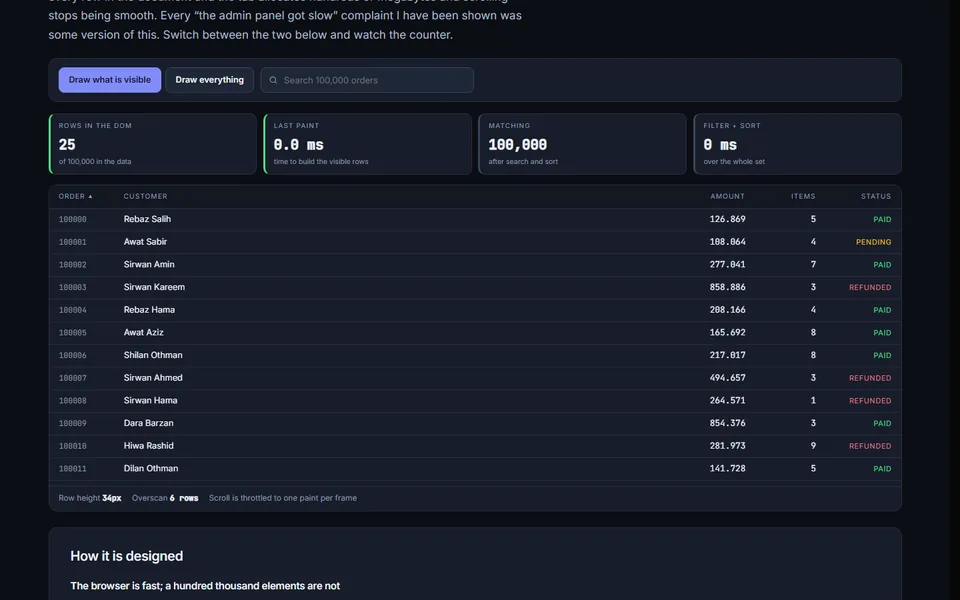
A hundred thousand rows — performance sample
The same 100,000-row table rendered two ways with the DOM node count live on screen: every row in the document, versus only the twenty you can actually see.
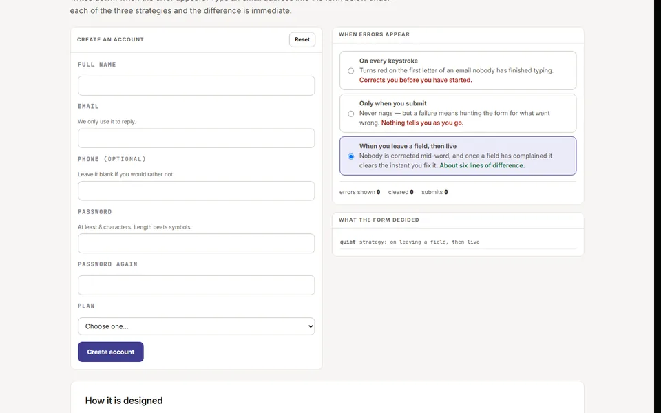
Form validation timing — interaction sample
The most common interface there is, ruined most often by one undocumented decision: when the error appears. The same form runs under three timing strategies so the difference is something you feel.
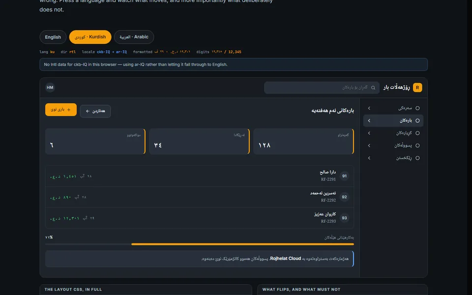
Bilingual RTL interface — design sample
One interface, three languages, one stylesheet. Kurdish, Arabic and English from the same markup — plus the parts that are never automatic: what must not mirror, and what numbers do inside a right-to-left sentence.
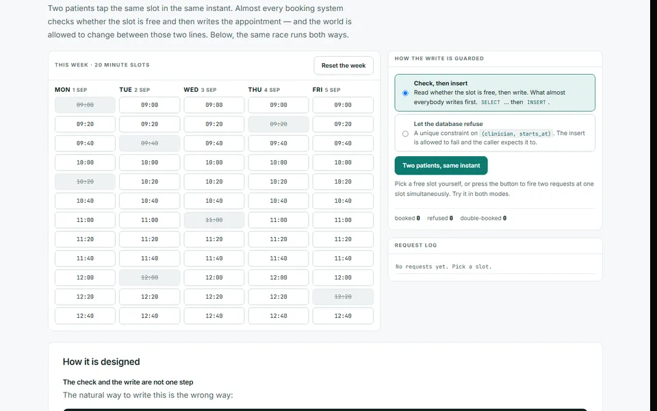
Appointment booking — system design sample
A clinic booking screen built around the bug you cannot find by clicking carefully: two patients tapping the same slot in the same instant. Run the race with and without a unique constraint and watch one version put two people in one chair.
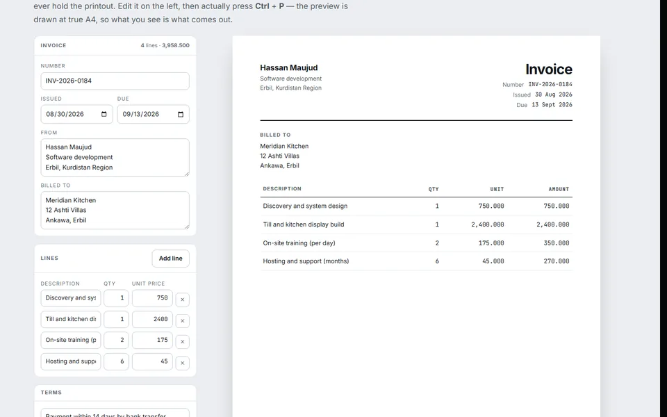
Invoice builder — document design sample
The only thing here designed for paper rather than a screen. An invoice editor with a true-A4 preview and a print stylesheet that holds up: repeating table headers, no split line items, and a total that can never be orphaned onto its own page.
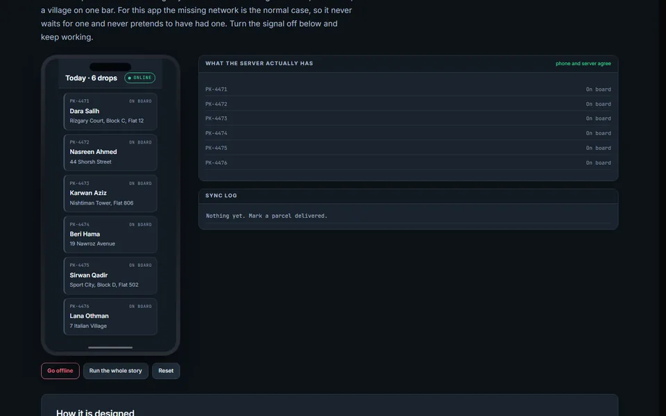
Offline-first courier app — application design sample
A delivery app built for no signal. Turn the network off and keep working: every action lands on the device and queues, every queued action carries a key so a resend cannot double-deliver, and the app never claims the server agreed when it has not.
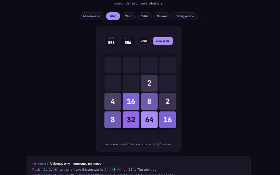
Six small games — interaction and algorithm sample
Six games, each built around one problem that is easy to get subtly wrong: a guess-free minefield, a 2048 that cannot double-merge, duplicate-letter scoring, the Tetris bag, a Sudoku with exactly one solution, and the sliding-puzzle parity trap.
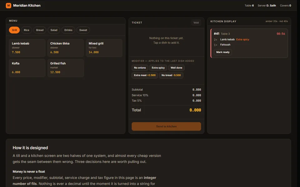
Restaurant till and kitchen display — system design sample
A working till and the kitchen screen it feeds: menu, modifiers that split a line, service and tax, and tickets that age in front of the chef. Every amount is an integer, never a float — and the page proves the difference live.
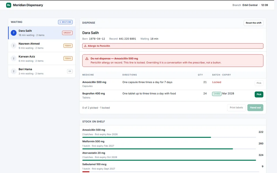
Pharmacy dispensing console — system design sample
A working dispensing screen: prescription queue, an allergy check that blocks rather than warns, first-expiry-first-out batch picking, a controlled-drugs register that cannot be edited, and live shelf stock.
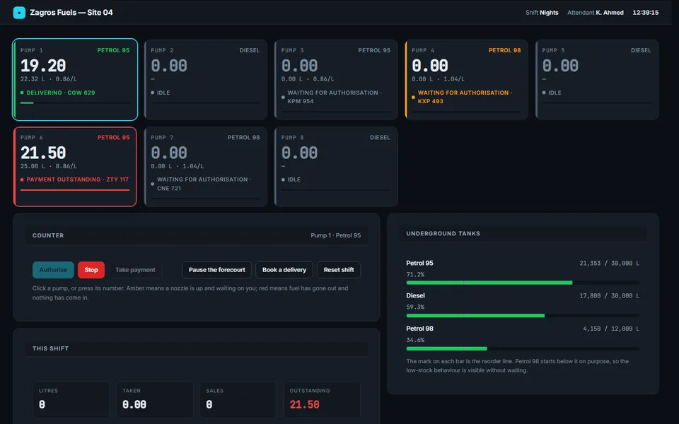
Fuel forecourt console — system design sample
A live simulation of a station back-counter screen: eight pumps on a real clock, authorise and settle, drive-offs that actually happen, tank levels that fall by exactly what was dispensed, and the shift reconciliation behind it.
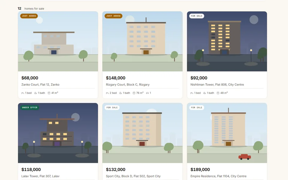
Property search — application design sample
An estate agency search that behaves: filters that read back as a sentence, a result count that cannot disagree with the list, a detail drawer that keeps your search, and a mortgage calculator that does the real amortising sum.
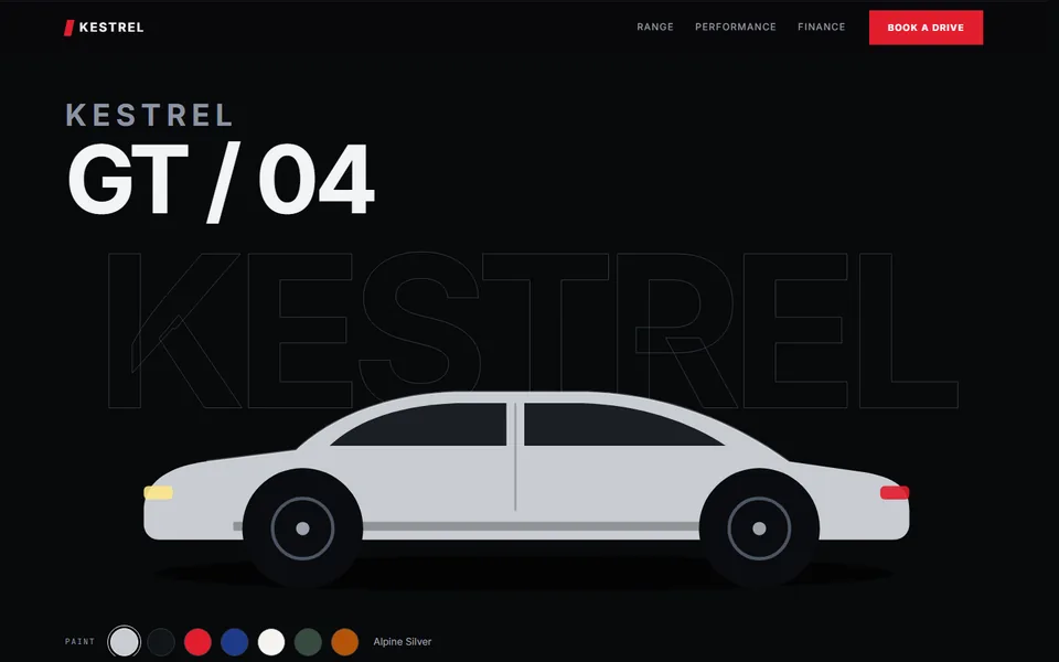
Car showroom — web design sample
A showroom page for an invented marque: a configurator that repaints the car, a spec strip that counts up as it comes into view, and a finance calculator running the real amortising sum.
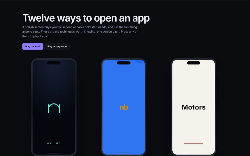
Twelve launch animations — motion design sample
Twelve app and website splash screens, each replayable on demand: mark assembly, liquid fill, stagger, mask reveal, orbit, typewriter, morph, shutter, zoom portal, skeleton, spring settle and a progress ring. Every one under a second.
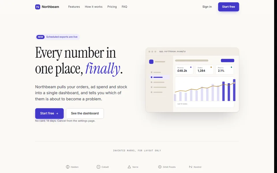
Marketing site — design sample
A complete landing page design: hero, feature sections, a pricing table with a working billing toggle, an accordion FAQ and a footer. Light, serif, generous — deliberately nothing like this portfolio.
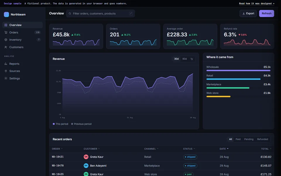
Admin interface — design sample
A working product UI: hoverable area chart, sortable and filterable table, detail drawer, toasts. Dense where the marketing sample is airy, because the two jobs are not the same job.
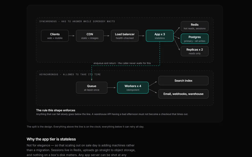
System design — an order system for one bad afternoon
A full design walkthrough: capacity estimate, topology, data model, the write path and why sending it twice is harmless, cache layers, and what breaks first.
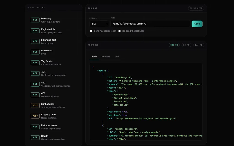
REST API & console
A working JSON API — token auth, pagination, ETag caching, rate limiting — with a console for firing real requests at it and reading what comes back.
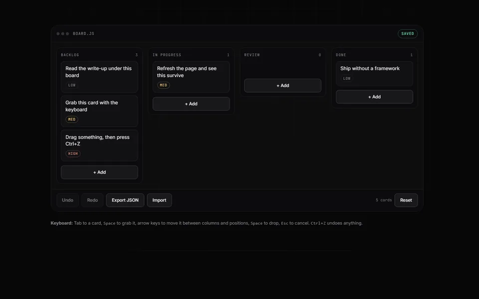
Task board
A complete front-end app in a single file: drag and drop, fully keyboard-operable, undo, and state that survives a refresh.
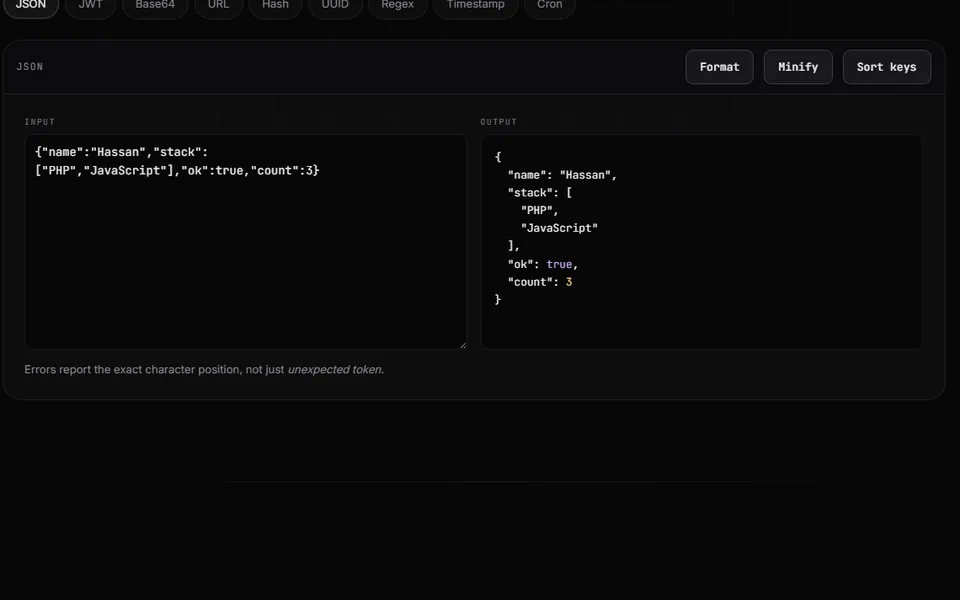
Developer toolkit
The small tools you end up pasting into a stranger’s website at 2am — JSON, JWT, regex, hashing, cron — rebuilt to run entirely in your own browser.
This site, and the CMS behind it
A static site with a full admin behind it. Pressing Publish regenerates every page, so the public site never runs PHP — and a PHP outage can never take it down.
Case study 01
Three games from the tea house — algorithm sample
Domino, Okey and Konkan — the games actually played over tea in Erbil, with opponents that really play. Built around the search that decides whether fourteen tiles split into sets and runs, which the obvious greedy version gets wrong.
The problem
Portfolio games are always the same handful, and they are always the ones with a rulebook in English. The games people here actually play over tea are domino, okey and konkan — and all three are folk games, which means the rules genuinely vary from one house to the next.
That is the first real problem, and it is not a programming one: there is no canonical version to implement. Pick a variant silently and somebody will tell you that is not how it is played, and they will be right. Each game on the page states the variant it uses, in a panel you cannot miss.
The second problem is that the last two games ask a question that is much harder than it looks: given fourteen tiles, can they be split into sets and runs? The obvious answer is wrong.
What I did
Domino: the ending everybody skips. Every implementation does "first to play all their tiles wins" and stops. But a large share of real games end blocked — tiles still in both hands and neither player able to move. Unhandled, the game simply hangs. Two consecutive passes end the hand and the lower pip count takes it, which is why the pip count is on screen.
Sixty games driven to completion: fourteen of them ended blocked, twenty-seven with me out and nineteen with the opponent out. Not an edge case — close to a quarter of all games.
Okey and Konkan need a search, not a greedy pass. The tempting check is: find the longest run, take it, repeat. It is wrong, and it is wrong in the way that survives testing — it looks right most of the time. Green 1–7, a red 4 and a blue 4, and black 1–5 is a winning hand, but only if the green run is broken either side of the 4 so that the 4 can join the set. Greedy takes the long run whole and reports a loss.
So it is an exhaustive search with memoisation: take the lowest remaining tile, try every group that could contain it, recurse. Exponential in principle; measured at 0.10–0.14 ms for fourteen tiles, which is what makes it safe to re-run on every single change.
The search answers the general question, not the yes/no one. It returns the most tiles it can cover, and a win is simply the case where that is all of them. I wrote the yes/no version first, and then noticed the hint under the rack promised a live read-out of the groups your hand makes — which a checker that only speaks at the moment of victory cannot give you. Generalising it made the hint true, put a running “nine of fourteen grouped” tally on screen every move, and collapsed the leftover-joker rule into nothing: a wildcard nobody spent is just an uncovered tile.
Wildcards make it harder, not easier. A joker can stand for any tile, so every branch has to try spending one as well as not — and a leftover joker is not a win, because every tile has to belong somewhere.
One search, two games. Konkan asks the identical question in a different costume, so it does not get its own algorithm. The checker takes an abstract {colour, number} and knows nothing about tiles or cards; a suit behaves exactly like a colour. A bug fixed in one is fixed in both.
Choosing the end is the whole of domino, and I had removed it. The first version placed your tile for you — it tried the right-hand end, then the left, and took whichever fitted. That is the entire strategy of the game decided by the order of two lines of code. Now a tile that fits both ends stops and asks which, with both open numbers shown on the buttons; a tile that fits one is simply played. Doubles are also laid across the chain rather than along it, which is the one visual cue that tells you at a glance where they went.
Three empty chairs is not a game. Okey shipped with the other three seats drawn but not played: you drew and discarded against nobody and could not lose. They are played now — real tiles, one discard pile each, play passing to the left, and each seat may take the discard of whoever played immediately before it, which for you is Right. Konkan got an opponent on the same terms. Both are scored by the same search the page is about: take the discard only when the search says the hand improves, then throw whatever the search can do least with. Neither one looks at your tiles.
The outcome
The greedy-versus-search claim on the page is one I got wrong first time and had to fix: my original example hand had a third 4 in it, which let greedy solve it another way and quietly made the page's own argument false. The hand now shown was checked both ways — greedy strands the red and blue 4s, the search returns set of 4 / run 1–3 green / run 5–7 green / run 1–5 black. The page computes that split by calling the same function the game calls, so it cannot drift from the code.
Greedy was implemented separately for the test rather than assumed: it takes green 1–7 and black 1–5 and strands both remaining fours. Also verified: a hand of rubbish is rejected rather than force-fitted, a joker correctly completes a run, and a hand with a joker left spare is not counted as a win. Timing measured at 0.10 ms on that hand and 0.14 ms on a fourteen with two wildcards in it — the worst case, because every branch has to try spending a joker as well as not.
The games were then played rather than merely opened. Sixty domino games driven to completion: every one terminated, no chain ever broke, and each blocked game awarded correctly to the lower pip count. Okey and Konkan were both driven to a genuine win with a solver picking the discards.
Two bugs came out of that which no amount of clicking around would have found: completing a hand at Konkan printed the win and then the next prompt overwrote it a frame later, and the “grouped” tally turned green whenever everything currently held made a group — including a thirteen-tile hand mid-turn, which reads as a win when it is not one.
After the opponents went in, the games were played again rather than assumed. Okey now ends with somebody going out: over two runs of ten hands the three opponents took seven and eight of them, I took one each time, and the rest ran past the test's patience rather than stalling. Losing three-to-one against three opponents is about right.
Konkan run with the same discard policy on both sides came out five games each, which is the number that matters — the opponent is fair rather than favoured. Given the same hands but a player who throws jokers away, it takes seven of eight. That gap is the opponent doing its job.
The end-choice in domino was checked over a hundred and twenty plies with both ends taken in turn: the chain never once broke, and every game still reached an ending.
Case study 02
A hundred thousand rows — performance sample
The same 100,000-row table rendered two ways with the DOM node count live on screen: every row in the document, versus only the twenty you can actually see.
The problem
A hundred thousand orders is not an unusual amount of data — it is one busy year. Render it honestly and that is a hundred thousand elements in the document: the tab allocates hundreds of megabytes, and scrolling stops being smooth.
Every "the admin panel got slow" complaint I have been shown was some version of this, and it is almost never a framework problem. Layout, style resolution and memory all scale with the number of elements, so the fix is not a faster renderer. It is fewer elements.
What I did
Draw only what is on screen. A spacer of the full height gives the scrollbar something truthful to describe, and about twenty rows are translated into place as it moves. The demo renders both ways on the same data with the node count and paint time above it, so the claim is a number you watch rather than an adjective.
Three heights have to agree or it tears. The row height in the stylesheet, the row height in the arithmetic, and the height of the spacer. If they drift, the rows detach from the scrollbar and the list appears to slip as you drag. One constant, referenced by both.
Overscan, or you see the seam. Drawing exactly the visible rows leaves a blank band during a fast flick, because the scroll event and the paint do not land on the same frame. Six extra rows above and below remove it.
One paint per frame, not one per scroll event. Scroll fires far more often than the screen redraws; rebuilding on every event is how a virtual list ends up slower than the thing it replaced. The handler sets a flag and lets requestAnimationFrame do the work once.
Sorting copies, filtering does not mutate. The view is derived and never replaces the source array — a sort that reorders the underlying data in place is a bug waiting for the next feature that assumes insertion order.
The outcome
Measured in a real browser rather than asserted. With 100,000 rows loaded the DOM holds 25 row elements; scrolled fifty thousand rows deep it still holds 25, and the first visible row is exactly the id the arithmetic predicts. The scroll height is 3,400,000 pixels — the full dataset at 34 pixels a row — so the scrollbar is telling the truth.
The write-up also says when not to hand-roll this: the moment row heights vary or columns need virtualising too, the arithmetic stops being index times height and a library becomes the cheap option.
Case study 03
Form validation timing — interaction sample
The most common interface there is, ruined most often by one undocumented decision: when the error appears. The same form runs under three timing strategies so the difference is something you feel.
The problem
Nobody writes down when an error should appear, so it gets decided by whichever event handler was easiest to reach — and that decision is most of what makes a form pleasant or hostile.
Validate on every keystroke and the field turns red on the first letter of an email nobody has finished typing. Validate only on submit and a failure means hunting the page for what went wrong. Both are common, and both are the result of not treating the timing as a design decision at all.
What I did
Validate when the user leaves a field, then live. Two rules: say nothing until they have left it once, and after that revalidate on every keystroke. Nobody is corrected mid-word, and anybody fixing a mistake sees it clear the instant it is fixed rather than having to submit again to find out. It is about six lines of difference from the version that feels hostile, and the page runs all three strategies on the same form so you can feel it rather than take my word.
Nothing is ever cleared. A failed submit keeps every value. This should not need saying and it still happens, usually because the form round-trips to a server that re-renders it empty.
The error summary exists for people who cannot see the fields. On a failed submit a list appears, focus moves into it, and each entry links to its field. A sighted user can scan for red borders; a screen-reader user submitting a long form has no way to discover anything went wrong unless focus is moved somewhere that says so. Each field also carries aria-invalid and an aria-describedby pointing at its own message.
Messages say what to do. "Use at least 8 characters" rather than "Invalid password" — the user already knows it is invalid, that is why it is red.
The email rule is deliberately permissive. One @, a dot after it, no spaces. Strict email patterns reject real addresses, and the only test that proves an address works is whether a message arrives.
The outcome
All three strategies were driven and checked: eager errors on the first character; submit-only stays silent through typing and blur and only complains on submit; the recommended one stays silent while you are still typing, complains when you leave the field, and clears the moment the value becomes valid.
A failed submit was verified to keep every typed value, show the summary, move focus into it, list each problem, and set aria-invalid and aria-describedby on the offending field. Nothing is submitted anywhere — the form makes no network request.
Case study 04
Bilingual RTL interface — design sample
One interface, three languages, one stylesheet. Kurdish, Arabic and English from the same markup — plus the parts that are never automatic: what must not mirror, and what numbers do inside a right-to-left sentence.
The problem
I build for a market where Kurdish, Arabic and English turn up in the same product, often on the same screen. That is a specific skill and it is almost never shown in a portfolio — so I built the demonstration.
Most "RTL support" is direction: rtl and a hope. It gets the boxes roughly right and leaves everything inside them subtly wrong, which is why so much bilingual software looks translated rather than designed.
What I did
One stylesheet, not two. The layout is written entirely in logical properties — margin-inline-start, border-inline-end, text-align: start — so it mirrors itself. Switching language changes exactly two attributes, lang and dir, plus the strings. There is not a single [dir="rtl"] layout override in the sample's CSS, and a check confirmed no physical margin-left/border-right/text-align: left anywhere in it. The alternative, a base sheet plus an RTL override file, means every future change has to be made twice and the second one gets forgotten.
A short, deliberate list of things that must not mirror. The logo does not: a mark is a picture of itself, and flipping it makes a different mark. Clocks and media controls do not. But the chevron meaning onwards does, and the progress bar fills from the right in Kurdish — getting that backwards is the single most common tell.
Numbers are isolated. Digits run left to right in all three languages, so prices and reference codes are wrapped in <bdi> or unicode-bidi: isolate. Without it the bidi algorithm reorders the surrounding punctuation and RF-2291 comes out as something else.
A font stack that actually covers the script. A Latin-only stack falls back to whatever the system has, and Kurdish renders in a substitute face with wrong metrics and broken joining. That one omission is why a lot of bilingual work looks unfinished even when the layout is right.
The outcome
Building it turned up something I did not expect, so it became the most useful part of the page: Kurdish Sorani has no Intl data in any current browser. Ask for ckb-IQ and you do not get an error — you silently get en-US, so a fully Kurdish screen renders "Aug 29" and Latin digits and nothing reports a problem until a user does.
The page detects that with supportedLocalesOf, falls back to ar-IQ — same script, same region, a far better wrong answer than English — and says so on screen rather than hiding it. It also corrected me: I had written that Iraqi Arabic uses Western digits, and ar-IQ in fact resolves to the arab numbering system. Which digits a client wants is a product decision, so the header prints both.
Case study 05
Appointment booking — system design sample
A clinic booking screen built around the bug you cannot find by clicking carefully: two patients tapping the same slot in the same instant. Run the race with and without a unique constraint and watch one version put two people in one chair.
The problem
Booking looks like the simplest thing in software and contains one of the nastiest ordinary bugs. Everybody writes the check the same way first: read whether the slot is free, then write the appointment. Between those two lines the world is allowed to change.
Two requests both read free, both insert, and the clinic has two people in one chair at 09:20. It is rare enough to survive testing and common enough to be a weekly complaint — and you cannot find it by clicking carefully, because a human cannot click twice in the same millisecond.
What I did
The race is made visible rather than described. A button fires two requests at one slot simultaneously, and a toggle switches between check-then-insert and a unique constraint. The race itself is identical in both modes; the only difference is who owns the rule.
The fix is not a longer check. A longer check has the same gap. The rule moves into the schema — UNIQUE (clinician_id, starts_at) — and the insert is allowed to fail: ON CONFLICT DO NOTHING RETURNING id, where no row back means you lost the race. Whoever loses gets an immediate, honest "that slot has just gone" and the calendar refreshes under them. That is a good experience; two people in one chair is not.
A free slot is not a row. The tempting model is a table of slots with an is_booked flag, which is wrong twice: you have to generate rows forward forever, and changing the opening hours means rewriting history. Only appointments are stored; free time is what is left after subtracting them from the working pattern, computed at read time. The week in the demo is generated exactly that way.
The constraint is the documentation. A rule enforced in application code holds until the next import script, admin tool or migration touches the table directly. A constraint holds against everything, including the developer at midnight with psql open.
The outcome
Measured rather than asserted. Twenty-five simultaneous races with check-then-insert produced fifty bookings, nothing refused, and twenty-five double-bookings. The same twenty-five races with the unique constraint produced twenty-five bookings, twenty-five clean refusals and zero doubles.
The clinic, the clinicians and the appointments are invented, and the server is simulated in the browser.
Case study 06
Invoice builder — document design sample
The only thing here designed for paper rather than a screen. An invoice editor with a true-A4 preview and a print stylesheet that holds up: repeating table headers, no split line items, and a total that can never be orphaned onto its own page.
The problem
Every other sample on this site is designed for a display. A document is a different medium: a fixed page height it cannot scroll past, no hover, no script, and a reader who may only ever hold the printout.
Print is also the part of front-end work most often skipped entirely — which is why so many invoices come out of a browser with the sidebar printed down the side of page one and the total stranded alone on page three.
What I did
The preview is true A4, or it is lying. A4 at 96 dpi is 794 × 1123 CSS pixels and the page is drawn at exactly that, so the line breaks on screen are the line breaks on paper. A preview at "roughly A4" is worse than none, because you only discover the difference after sending it.
The table header repeats on every sheet. thead { display: table-header-group } — one declaration, almost nobody writes it, and without it page two is a column of unlabelled numbers.
Nothing important can be orphaned. break-inside: avoid keeps each line item whole and break-before: avoid keeps the totals with the table. An invoice whose total sits alone at the top of page two gets queried instead of paid.
The page box is set explicitly. @page { size: A4; margin: 14mm 15mm }, because the browser's own default differs between browsers and printers and the layout otherwise shifts on somebody else's machine.
Nothing meaningful is carried by a background. Browsers drop background colours when printing, so every distinction in the document is a border, a rule or a weight. Links print their URL after them, since a reader holding paper cannot click.
Money is integers, held in minor units and formatted only at the very end — the same rule as the till sample, because a document that disagrees with the ledger by one fil is one somebody reconciles by hand.
The outcome
Verified by actually printing it. The normal invoice produces a one-page PDF with a MediaBox of 595 × 842 points, which is A4 exactly. Extended to forty-four line items it paginates to three pages, and rendering the print rules on screen confirms the editor, the hero and the write-up all stay off the paper — only the document prints.
The client and the figures are invented.
Case study 07
Offline-first courier app — application design sample
A delivery app built for no signal. Turn the network off and keep working: every action lands on the device and queues, every queued action carries a key so a resend cannot double-deliver, and the app never claims the server agreed when it has not.
The problem
A courier spends half the working day somewhere with no signal — a basement car park, a lift, a stairwell, a village on one bar. Almost every delivery app is built as though the network were always there, with an offline mode bolted on afterwards as a courtesy. That gets the priority exactly backwards for the person actually holding the phone.
It is also the only phone-shaped application in this set, which was the gap I built it to fill: everything else here is a desktop console or a web page.
What I did
The phone is the source of truth until the server catches up. Every action is written locally and appended to a queue, and the screen updates the instant the driver taps. The network changes only how soon the action leaves — never whether the work can continue. Making somebody in a stairwell wait on a spinner is not a design, it is an apology.
Every queued action carries a key generated on the device, before anything is sent, so a resend keeps the same one. The network is allowed to deliver an action twice; the server is required to count it once. The demo deliberately loses about a quarter of the replies after the server has already applied them — which is precisely the case that double-delivers a parcel when there is no key — and the log shows the resend being accepted and changing nothing.
It says "queued", never "sent". A card that has not reached the server is drawn with a dashed border and labelled. Optimistic interfaces that show a confident tick the moment you tap are how a driver finishes a shift believing sixteen parcels are signed for when the server has eleven, and the argument about who is wrong happens the next morning with no evidence.
The queue is strictly ordered, and a failure holds it rather than letting later actions overtake. Delivered arriving before picked up is a sequence the server would have to reject, and preventing it on the client is far cheaper than reasoning about it on the way in.
The server is shown next to the phone, deliberately. Most of the value of this design is only visible as a divergence, so the demo puts both states on screen and tells you when they disagree.
The outcome
Driven end to end in testing: with the signal off, the phone showed two parcels delivered while the server still had all six on board and three actions queued. On reconnect the queue drained to zero, every job matched on both sides, and the log recorded two retries — replies genuinely lost after the server had applied them, where the key stopped the second attempt from counting twice.
The company, the addresses and the server are all invented, and the app makes no network request of any kind.
Case study 08
Six small games — interaction and algorithm sample
Six games, each built around one problem that is easy to get subtly wrong: a guess-free minefield, a 2048 that cannot double-merge, duplicate-letter scoring, the Tetris bag, a Sudoku with exactly one solution, and the sliding-puzzle parity trap.
The problem
A dashboard screenshot can hide a dozen unfinished states. A game cannot: it either plays correctly or it visibly does not, in front of the person judging it.
So I built six, and picked each one for a single problem that is genuinely easy to get wrong — the kind that survives casual testing and then embarrasses you in front of a user. Each game's write-up names its problem and shows the fix.
What I did
Minesweeper: a board you never have to guess on. Two things separate a fair minefield from an irritating one. The first click is never a mine — the mines are laid after you click, with the clicked square and its whole neighbourhood excluded, so the opening move always opens the board rather than ending the game on a coin flip. Then the generator runs a deduction solver over the board it just laid and re-lays it if the solver gets stuck, up to a bounded number of attempts. Across 120 generated boards in testing, 120 came back guess-free and none killed the first click.
The solver is deliberately incomplete — it applies the two obvious rules and not the pairwise subset rule — which makes it conservative: a board it can finish is definitely solvable by logic, and it may reject some a strong player could manage. For a generator that is the right way round. It is also bounded, because a generator that loops until it succeeds is a generator that can hang the tab.
2048: a tile may only merge once per move. Push [2, 2, 4] left and the answer is [4, 4], not [8]. The obvious loop — walk the row, combine equal neighbours — produces the 8, and the bug is intermittent, so it survives testing and then hands the player a tile they did not earn. The fix is to compact first and merge in one pass with an index that steps past what it just consumed. Driven through 1,200 random moves, no tile ever took a value that was not a power of two and the board never exceeded sixteen tiles.
Undo falls out for free, because a move builds a new board instead of editing the old one — the whole history is a push and nothing else.
Word: the duplicate-letter problem. Guess ERROR against OTHER. The answer holds one R and the guess holds three; exactly one may be coloured, and it has to be the right one. The one-pass version — green if it matches, amber if the answer contains it — colours all three, and practically every fresh implementation ships that bug. The correct algorithm needs two passes: mark the exact hits while counting what remains of each letter, then walk the rest and colour amber only while that letter's count is above zero. Tested across 121 word pairs, no letter was ever coloured more times than it actually appears.
Tetris: random is not the same as fair. Choosing each piece with Math.random() is fair over ten thousand pieces and miserable over ten — the droughts it produces get reported as bugs. A 7-bag fixes it: shuffle all seven, deal them out, refill. Observed across 53 refills in testing, every bag was a permutation of all seven pieces, so nothing can wait more than twelve pieces or arrive three times running. The bag is drawn on screen because it is the point.
Sudoku: a puzzle with two answers is not a puzzle. Build a complete grid by randomised backtracking, remove clues one at a time, and after each removal run a second solver that counts solutions and stops at two — if the answer is not exactly one, put the clue back. That counting pass is the step most tutorials skip. Twelve generated puzzles across four difficulties were checked with an independent solver: every one had exactly one solution.
Sliding puzzle: half of all shuffles are impossible. Shuffle the fifteen tiles as an array and there is a fifty per cent chance no sequence of legal moves can finish it — the board looks completely ordinary. Shuffling by making legal moves keeps every state reachable by construction. Measured: 50 out of 50 legal-move shuffles solvable, against 22 out of 50 for the array shuffle. The broken version is left on the page as a button, so the claim can be seen rather than believed.
The outcome
The worked example on the word game's page is rendered by calling the game's own scoring function rather than by typing the colours in, so the explanation cannot drift away from the code it describes.
All six are plain JavaScript in two files — no framework, no build step, and no network request of any kind. Nothing is scored, saved anywhere, or sent to a server.
Case study 09
Restaurant till and kitchen display — system design sample
A working till and the kitchen screen it feeds: menu, modifiers that split a line, service and tax, and tickets that age in front of the chef. Every amount is an integer, never a float — and the page proves the difference live.
The problem
A till and a kitchen screen are two halves of one system, and the cheap versions get the seam between them wrong in the same three ways every time.
This is also the most commercially ordinary thing in the set — a restaurant, a menu, a bill. That is deliberate. The interesting engineering in this kind of work is never the layout; it is the arithmetic and the timing, and neither of those photographs well, so most portfolios skip them.
What I did
Money is never a float. Every price, modifier, subtotal, service charge and tax figure is an integer number of the minor unit. Nothing becomes a decimal until it is turned into a string for display. The minor unit here is deliberately 1000 rather than 100, so any code quietly assuming two decimal places would break loudly instead of silently.
The page proves it rather than asserting it: it rings the same ticket through both ways, five thousand times, and prints the drift. It comes to 2,500 minor units — two and a half currency units missing from one service — with the float noise still visible in the trailing digits. A till that does this loses a little every day, the drawer does not balance at close, and the person who gets blamed is the cashier rather than the developer who wrote 0.1 + 0.2.
The kitchen clock starts when the kitchen gets it. Not when the waiter began tapping. A ticket that sat on the till for four minutes while a table argued about drinks is not four minutes late in the kitchen, and colouring it red would teach the staff to ignore the colour — which is the only thing the display is for.
A modifier splits the line rather than changing it. Add two lamb kebabs, tap extra spicy, and the line splits: one spicy, one plain. Applying it to the whole stacked line is easier to write and sends the kitchen an instruction nobody asked for.
Rounding is a decision, written down. Tax is charged on the subtotal plus service here. That is a policy, not a default, and it lives in one commented function rather than being implicit in the order of two lines.
The outcome
The arithmetic was checked by hand against the running page: four dishes at 22.500 give service 2.250, tax 1.238 and a total of 25.988, and the modifier correctly splits a stacked line instead of altering it.
The restaurant, the menu and the prices are invented, and a bar at the top of the page says so and cannot be scrolled away.
Case study 10
Pharmacy dispensing console — system design sample
A working dispensing screen: prescription queue, an allergy check that blocks rather than warns, first-expiry-first-out batch picking, a controlled-drugs register that cannot be edited, and live shelf stock.
The problem
Most software that looks like this is a shopping basket wearing a lab coat. Somebody picks items, a dialog says are you sure, and the dangerous case is separated from the safe one by a single click made under time pressure.
A dispensing counter is not that. The person using it is fast, interrupted every ninety seconds, and legally responsible for what leaves the shop. I wanted a specimen where the interesting decisions were safety decisions rather than visual ones — and where you can sit down at it and try to break it.
What I did
The allergy check blocks. It does not warn. Pick Dara Salih in the queue: penicillin is on the record, the prescription contains amoxicillin, and that line simply cannot be dispensed. There is no proceed anyway button anywhere in the interface, because a confirmation dialog under time pressure is just a slower way of saying yes. Overriding it is a phone call to the prescriber, which is a conversation, not a click.
Batches are chosen, not asked about. The console never puts a dropdown of box numbers in front of a human at speed — it picks the batch expiring soonest and shows what it took. Leaving that to judgement is exactly how short-dated stock ends up at the back of the shelf until it is waste. Anything inside ninety days is flagged amber as it is picked.
Controlled drugs need a second pair of eyes. A CD line will not complete without a witness, and the entry it writes is append-only: quantity, running balance, both signatures, timestamp. Corrections are made by adding a correcting entry, never by editing the original — the same discipline a paper register has, for exactly the same reason.
Stock is a ledger, not a number. Every dispense writes one movement row per batch inside the same transaction as the dispense record, so where did those eleven go is always answerable, and a crash between the two writes cannot leave the shelf count disagreeing with the audit trail.
Colour is rationed. Almost the entire screen is black on white. Red appears in exactly one situation and amber in one other, which is the only reason either of them still means something at four in the afternoon.
The outcome
It is a specimen, not a product, and the page says so at the top in a bar that cannot be scrolled away. The patients, the medicines and the branch are invented, and nothing on it is clinical advice.
What it demonstrates is the part of this work that does not photograph well: that the schema, the transaction boundary and the refusal to add an override button are the design, and the layout is downstream of them.
Case study 11
Fuel forecourt console — system design sample
A live simulation of a station back-counter screen: eight pumps on a real clock, authorise and settle, drive-offs that actually happen, tank levels that fall by exactly what was dispensed, and the shift reconciliation behind it.
The problem
A forecourt screen has one requirement no dashboard has: it has to be readable by somebody who is not looking at it. The attendant is serving a customer, facing away from the wall, and glancing up between transactions — at two in the morning, under strip lighting, from three metres.
That single constraint decides everything else, and it is the opposite of what a dashboard optimises for. So I built one, and made it run rather than sit still.
What I did
It is a simulation, not a mock-up. Eight pumps run on a 250 ms clock. Litres and money tick up together, the underground tanks fall by exactly what the pumps took, customers arrive on their own, and the transaction log is written from the same numbers the tiles are showing. You can authorise, stop mid-fill, take payment at the counter, book in a tanker delivery, and reset the shift.
State lives in colour, and there are only four. Grey is nothing, green is delivering, amber is a nozzle up and waiting on you, red is fuel gone with nothing taken for it. The words underneath exist to confirm a decision already made from across the room, not to make it.
Only the loss case is allowed to move. A screen where everything animates is a screen nobody looks at. The green dot pulses because work is in progress and the red border breathes because money is walking away — and nothing else on the page moves at all, which is the only reason those two are impossible to miss.
The tank is decremented on the same tick as the pump. Not at the end of the sale, and not from a summed total at close of shift. The obvious implementation loses the entire difference silently if anything crashes mid-shift; taking it litre by litre means the worst case is a partial delivery that is still visible in both places.
Drive-offs are designed for, not reported on. Leave a pump amber without authorising it and the customer eventually gives up and leaves — the console tells you, and the sale is gone. A demo that only ever walks the happy path teaches nobody anything about the system.
The outcome
The diagram underneath the console is the actual point: five pump states, the two edges where money is lost, and three independent counts — pump totaliser, tank dip, transaction log — that have to agree by morning.
The brand, the prices and the staff are invented. The reconciliation problem is not.
Case study 12
Property search — application design sample
An estate agency search that behaves: filters that read back as a sentence, a result count that cannot disagree with the list, a detail drawer that keeps your search, and a mortgage calculator that does the real amortising sum.
The problem
Property search is a solved problem that almost nobody solves well, and the reason is not technical. The incentives point away from the person searching: sponsored placement above relevance, sold stock quietly hidden so the inventory looks deeper than it is, a monthly figure that leaves out the total repaid.
I wanted a search that went the other way on every one of those, and to find out whether an interface that refuses those tricks is actually worse to use. It is not.
What I did
The count is a sentence, not a number. 3 results is unverifiable. 3 homes to rent — flats only — 2+ beds can be checked against the grid below it in about a second, so a filter that silently failed to apply is visible immediately rather than six scrolls later. It costs one line of code and deletes a whole category of bug report.
Under-offer stock stays visible, badged. Hiding it makes the search look thinner than the market is, and what a serious buyer wants first is what has been going and at what price.
The mortgage figure is a real calculation. Open anything for sale and move the sliders: it runs the standard amortising payment, handles a 0% rate separately instead of dividing by zero, and puts the total repaid underneath — the number that changes minds and the number these tools always leave out.
The drawer never loses the search. Detail opens over the results rather than navigating away, returns focus to the card you came from, closes on Escape, and is inert while shut so the keyboard cannot wander into a hidden panel.
The photographs are drawn. Every listing gets an illustration generated in SVG from its own id, so it is stable across reloads and filters and could never be mistaken for a real property. The building even draws the right number of floors with the listed one lit, because a picture that contradicts the facts beside it is worse than no picture.
The outcome
Eighteen invented properties, each one hand-checked so the facts are internally consistent — no two-bed flat with four bathrooms, no rental priced like a purchase.
The useful thing to try is the empty state: narrow it until nothing matches. That screen is where most search interfaces give up, and it is the one worth designing properly.
Case study 13
Car showroom — web design sample
A showroom page for an invented marque: a configurator that repaints the car, a spec strip that counts up as it comes into view, and a finance calculator running the real amortising sum.
The problem
Car pages are the most over-designed category on the web and among the least useful. Enormous video, parallax that fights the scrollbar, and the two things anybody actually came for — what it looks like in the colour I want, and what it costs a month — buried three clicks down behind a lead capture form.
So: the same visual ambition, both of those answers on the first screen, and no video at all.
What I did
One car, one repaintable path. The vehicle is hand-drawn SVG with the body isolated as a single path driven by a custom property, so the paint picker recolours it instantly with no image swap, no preloading, and no second network request. Shadows and glass sit in their own layers so they stay right at every colour.
The spec strip counts, once. Figures animate up when the strip first enters the viewport and never again, because a number that re-animates every time you scroll past stops reading as information and starts reading as decoration.
The finance figure is real. Deposit, term and rate are live, and the monthly payment is the standard amortising formula rather than a price divided by a number of months. Total cost of credit is shown underneath, which is the figure a showroom page usually declines to print.
Nothing moves that does not mean something. The whole page runs off one requestAnimationFrame loop shared with the rest of the site, and every animation is off under prefers-reduced-motion — including the count-up, which jumps straight to its final value rather than being skipped.
The outcome
The marque, the model, the prices and the specifications are invented, and a bar at the top of the page says so and cannot be scrolled away.
What it is really demonstrating is restraint: one interaction that matters, one number that matters, and a drawing good enough that no photograph was needed.
Case study 14
Twelve launch animations — motion design sample
Twelve app and website splash screens, each replayable on demand: mark assembly, liquid fill, stagger, mask reveal, orbit, typewriter, morph, shutter, zoom portal, skeleton, spring settle and a progress ring. Every one under a second.
The problem
A splash screen is the only animation a user is forced to watch, and they watch it every single time they open the thing. That makes it the least forgiving motion brief there is: it has to survive the four-hundredth viewing.
Most of them fail the same two ways — too long, and animating properties that cannot be composited, so the one moment the device is busiest is the one moment the animation stutters.
What I did
Twelve distinct approaches, replayable. Mark assembly, liquid fill, staggered reveal, mask wipe, orbit, typewriter, shape morph, shutter, a zoom portal that becomes the background, a skeleton that shows the shape of what is loading, a spring settle written as a linear() ramp, and a progress ring for when the wait is genuinely long. Each one has a replay button, because the entire point of a launch animation is how it holds up on repeat and a demo you can only see once tests nothing.
Transform and opacity only. Nothing here animates a width, a top, or a box-shadow. Everything runs on the compositor, so it stays smooth on the frame where the app is actually loading — which is the only frame that matters.
Under a second, all of them. The longest is 900 ms end to end. Anything past that and you are making people wait for your logo rather than covering a load you were doing anyway.
Reduced motion is a first-class state, not a switch-off. Under prefers-reduced-motion each screen resolves instantly to its finished frame — mark placed, wordmark set, nothing missing. The brand still lands; it just does not move.
Each one is self-contained. No library, no build step, one CSS file and about eighty lines of JavaScript for the replay wiring, and every screen is scoped so it can be lifted out on its own.
A page about motion has to answer for reduced motion. With prefers-reduced-motion set, the stylesheet holds every screen at its finished frame — correct, but it also meant all twelve replay buttons and both play buttons were controls that did nothing, while the heading went on telling you to press them. Now the page says what it is doing, switches those controls off so they look as dead as they are, and offers the animations to anyone who asks for them; motion the user requests is allowed, and describing twelve animations to someone instead of showing them is a poor trade. The still version is still what you get with JavaScript off, because the opt-in is a :not() on the media query rather than a class the script has to add.
Replay only ever worked on one of the twelve. The usual restart trick — remove the class, force a reflow, add it back — restarts an animation only when the class is what adds it. One screen here is built that way; the other eleven declare their animation on the element and use the class to flip animation-play-state, and un-pausing an animation that has already reached its end does nothing whatsoever. So the stroke-draw screen replayed and the rest sat there. It is a silent failure: no error, no visual, nothing to search for.
Replay now rewinds explicitly — getAnimations({subtree: true}), currentTime = 0, play() — which also reaches pseudo-element animations, and the skeleton shimmer is on a ::after. Measured across all twelve screens: 61 finite animations, 61 stuck at their end before the fix, 0 after.
The outcome
The marks and wordmarks are invented, and none of them belongs to a real company.
The honest finding from building all twelve in a row: the two simplest — the mask wipe and the stagger — are the two that hold up best after the twentieth replay, and the cleverest one is the first to wear out.
Case study 15
Marketing site — design sample
A complete landing page design: hero, feature sections, a pricing table with a working billing toggle, an accordion FAQ and a footer. Light, serif, generous — deliberately nothing like this portfolio.
The problem
A portfolio that only ever shows one visual language proves one thing: that its owner can build the site you are already looking at.
So this sample had to be as far from the surrounding site as I could reasonably take it. That one is dark, tight, technical, sans-serif. This one is light, warm, generous, and set in a serif. Same person, different brief.
What I did
A real design system, not a page. One scale of type, one spacing rhythm, one ink colour doing almost all the work with a single accent. Every component on the page — cards, tiers, pills, the FAQ — is built from those decisions rather than styled individually.
Scoped so it cannot leak. All of it lives under a single .smp class with its own custom properties. Dropping a specimen into a portfolio usually means one of them poisoning the other; this one cannot reach outside itself, and does not follow the site's theme toggle because a specimen should look the same to everybody.
Three interactions, no framework. A billing toggle that reads both prices off the element rather than calculating one from the other, an accordion built on <details> so the keyboard behaviour is the browser's, and a sticky header that costs one class change per frame.
Labelled, permanently. A bar at the top that cannot be scrolled away says the product is fictional. A design sample that could be screenshotted and passed off as a real company's site is not a sample, it is a liability.
The outcome
It is a page you can read end to end and judge as a design, rather than a thumbnail in a grid.
The hardest part was not the layout. It was writing copy good enough that the design has something real to hold — a landing page full of lorem ipsum tests nothing, because the thing being designed is the relationship between the words and the space around them.
Case study 16
Admin interface — design sample
A working product UI: hoverable area chart, sortable and filterable table, detail drawer, toasts. Dense where the marketing sample is airy, because the two jobs are not the same job.
The problem
Dashboard mockups are the easiest thing in the world to fake. Pick some numbers that look good, draw a nice curve, ship the screenshot.
The result is a design nobody has ever tested against the thing that actually breaks these interfaces: real ranges, empty states, long names, and a table with more rows than fit.
What I did
The data is generated, but consistent. A seeded generator, so the page is identical on every load and a screenshot matches what a visitor sees. More importantly the tiles are derived from the same rows the table shows — revenue divided by the actual average order value gives the order count. Inventing those independently is how a dashboard ends up claiming an average order none of its own rows could produce, which is the first thing anyone who works with the data will notice.
The chart is drawn from the numbers. Axis labels, guides and the comparison line all come out of the same array. Hovering reads the nearest real point rather than interpolating, because the figure under the cursor should be one that exists.
The table does what tables have to do. Sort on any column, filter as you type, paginate, and an empty state that says which filter is responsible. Pressing / focuses the filter.
A drawer, not a page. Opening an order does not lose your place in the list. It traps focus, closes on Escape, and returns focus to the row you came from.
The outcome
An interface that survives being used rather than being looked at.
The detail I would point at in a review is the empty state. It is three lines of code and it is the difference between a table that looks broken when a filter matches nothing and one that explains itself.
Case study 17
System design — an order system for one bad afternoon
A full design walkthrough: capacity estimate, topology, data model, the write path and why sending it twice is harmless, cache layers, and what breaks first.
The problem
Every system design write-up on the internet ends up drawing the same boxes. Load balancer, some app servers, a cache, a database. The diagram is never the hard part.
What is missing is the reasoning: the numbers that ruled options out, the thing that was deliberately not built, and an honest account of what falls over first.
What I did
Wrote the design the way a review actually goes — from the constraint, not from the picture.
The numbers come first. A back-of-the-envelope estimate puts peak writes at two per second and the read-to-write ratio at around 800 to 1. That single pair of figures rules out most of the architecture the internet would suggest: two writes a second is not a distributed-database problem, it is a caching problem wearing a scaling problem's coat.
One line drawn before any box. What is allowed to make a customer wait, and what is not. Everything below that line can fail, retry, and try again in ten minutes — which is why a warehouse API having a bad afternoon never becomes a checkout that times out.
Three diagrams that each make one argument. The topology shows the synchronous split. The data model shows why stock is a ledger rather than a counter, and why money is an integer. The sequence diagram shows a duplicate checkout being made harmless by a unique index rather than by application code.
A failure table. Six components, what happens when each one stops, and whether that answer is acceptable.
The outcome
A design document that can be argued with, which is the only kind worth writing.
It closes with the three decisions I would expect to be challenged in review and why I would concede two of them under different constraints. A drawing that cannot tell you what it gives up is a picture, not a plan.
Case study 18
REST API & console
A working JSON API — token auth, pagination, ETag caching, rate limiting — with a console for firing real requests at it and reading what comes back.
The problem
Anyone can say they build APIs. Almost nobody shows one you can actually hit, which means the reader has to take the claim on trust.
So the brief I set myself was: a JSON API on this domain, running for real, that a visitor can send arbitrary requests to from the page — including the requests designed to break it.
What I did
A small PHP 8 service behind a single front controller. Every request goes through the same pipeline: route match, rate-limit check, optional bearer-token auth, handler, response envelope.
The parts worth pointing at:
Conditional requests. Every collection and item response carries a strong ETag derived from the representation. Send it back as If-None-Match and you get a 304 with no body — the console shows the byte difference.
Rate limiting. A fixed-window counter per client, with X-RateLimit-Limit, -Remaining and -Reset on every response and a Retry-After on the 429. You can exhaust it from the console on purpose.
Errors are a contract. One shape for every failure — a machine code, a human message, and per-field detail for validation. A client should never have to parse prose.
Writes need a token. POST and DELETE require a bearer token. The console will mint you a scoped one that expires, so the write path is demonstrable without leaving the door open.
The outcome
It is running on this site now. The console records every request it makes — status, latency, response headers, body — so the caching and rate-limit behaviour is visible rather than described.
The interesting constraint was that it had to be safe to leave unattended on a shared host: no database, bounded writes, a per-visitor sandbox, and nothing retained.
Case study 19
Task board
A complete front-end app in a single file: drag and drop, fully keyboard-operable, undo, and state that survives a refresh.
The problem
Drag-and-drop boards are the standard front-end demo, and most of them share the same two failures: the state model is scattered across the DOM, and you cannot operate them without a mouse.
I wanted to see whether I could avoid both without reaching for a framework.
What I did
One immutable state object, one reducer, one render. Every change — adding a card, dragging it, renaming a column — is an action dispatched against that store. Nothing reads truth out of the DOM.
That single decision buys three features almost for free:
Undo and redo. Each dispatch pushes the previous state onto a bounded stack. Ctrl+Z and Ctrl+Shift+Z walk it.
Persistence. The store is serialised on every commit, so a refresh restores exactly where you were — including the undo history.
Export and import. The state is the file format. There is nothing to convert.
Dragging is built on pointer events, so it behaves the same with a mouse, a trackpad or a finger. The keyboard path is not a fallback: every card is focusable, and the arrow keys move a grabbed card between columns and positions with the change announced to a screen reader.
No browser dialogs. Adding a card was window.prompt(), renaming was another, resetting was confirm(), and a bad import was two alert()s. That is the one place on this site that fell back to browser chrome for its primary interaction — unstyled, unreadable on a phone, and blocked outright by Chrome inside a cross-origin frame, where “+ Add” would simply do nothing. Adding now opens a composer in the column it will add to and stays open for the next card; renaming happens in the card, so you can see what you are editing; Reset arms itself and disarms after four seconds; and a bad paste reports the actual parse error next to the field it came from.
The outcome
About 600 lines of plain JavaScript, no dependencies, and it runs offline once the page is loaded.
The keyboard requirement turned out to be the useful constraint rather than the expensive one — it forced the move operation to exist as a real action in the store instead of as a side effect of a mouse gesture, which is what made undo trivial afterwards.
Case study 20
Developer toolkit
The small tools you end up pasting into a stranger’s website at 2am — JSON, JWT, regex, hashing, cron — rebuilt to run entirely in your own browser.
The problem
Everyone has done it: you need to decode a JWT, so you paste it into the first site the search returns. That token is a credential, and you have just posted it to somebody else's server.
The same goes for the JSON you are debugging and the string you are hashing. The convenience is real; so is the leak.
What I did
A set of tools that never make a network request. Not “we promise not to log it” — there is no endpoint to send it to. The page works with the network disconnected, which is the only version of that promise a reader can verify.
Hashing uses the browser's own Web Crypto implementation rather than a bundled library, so there is less of my code between the input and the digest. The JSON tools run on the native parser and report the exact position of a syntax error instead of the usual unhelpful message. The regex tester runs the pattern with a step budget, so an accidentally catastrophic backtrack shows a warning rather than hanging the tab.
The outcome
Nine tools, one page, no dependencies and no requests. It is the piece on this site that gets used rather than looked at, which was the point.
It also makes an argument I would rather demonstrate than assert: most things built as a service do not need to be one.
Case study 21
This site, and the CMS behind it
A static site with a full admin behind it. Pressing Publish regenerates every page, so the public site never runs PHP — and a PHP outage can never take it down.
The problem
A portfolio has two requirements that pull against each other. The owner needs to edit it without touching code. The visitor needs it to be fast and to never be down.
A CMS gives you the first and costs you the second: every page view becomes a PHP process and a database round trip, and any of those can fail. A hand-written static site gives you the second and costs you the first.
What I did
Split the two apart in time. The admin is a normal PHP application, but it only runs for a logged-in operator. Pressing Publish renders every template to a static .html file on disk, along with the sitemap, the RSS feed, robots.txt and the social share card.
The public site is then plain files. No PHP, no database, nothing to fall over.
The details that took the time:
Atomic writes. Every generated file is written to a temporary file and renamed into place. A publish interrupted halfway cannot leave a truncated page being served.
Uploads are re-encoded, not stored. An uploaded image is decoded and re-encoded to WebP. That re-encode is the security model — a file that is both a valid image and a valid script does not survive it. SVG is refused outright.
Structured data is escaped properly. JSON-LD goes through an encoder that escapes angle brackets, because plain json_encode does not — and a </script> typed into any admin field would otherwise break out of the block. That was a live stored-XSS, caught by the test suite.
Cache busting is deliberate. Assets are served immutable for a year, so publish bumps a version string that is appended to every asset URL. Without it a returning visitor keeps the old stylesheet forever.
The outcome
Editing is a form. Deploying is a button. Serving is a file read.
The trade is that content changes require a publish step rather than appearing instantly — which for a site that changes a few times a month is the right side of the bargain.
Want to go deeper?
Happy to walk through any of it properly — the constraints, the trade-offs, the parts I would do differently.